Copyright 2025 Cameron Arensdorf
65
Homepage Lighthouse
71
Services Lighthouse
65
Contact Lighthouse
9+
WCAG criteria violated
Lighthouse Audit Scores
Problem
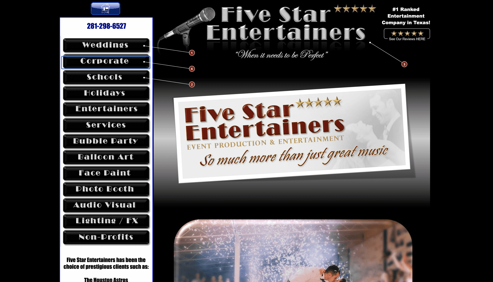
The site’s WYSIWYG platform rendered every navigation button as a PNG image instead of accessible text. This made the global navigation difficult for screen reader and keyboard users to understand, navigate, and use.
Key barriers
Screen reader barrier
Nav items were announced as repeated, unlabeled “link, image” elements instead of clear destinations like “Services,” “Gallery,” or “Contact.”
Keyboard barrier
Users had to Tab through 30+ unlabeled elements before reaching page content.
Maintenance barrier
Alt text would help, but it would not fix repeated tab stops, missing landmarks, weak focus visibility, or long-term maintenance risk.
Recommendations
Replace the image-based navigation with semantic text links and an accessible global navigation structure.
AI collaboration
I used AI to inspect repeated source-code patterns and speed up WCAG cross-referencing. I manually validated every finding through keyboard testing, Chrome DevTools, and W3C documentation.
Research
Automated tools surfaced structural issues, while manual testing showed how those issues affected the navigation experience. Using both made the audit more credible, with manual testing surfacing other issues automated testing did not catch.
Manual keyboard testing
I used Tab and Shift+Tab to move through interactive elements and evaluate link identification, bypass paths, focus visibility, and access to main content.
Source code inspection
I reviewed page structure in Chrome DevTools to confirm whether navigation, headings, and landmark regions were programmatically available to assistive technology.
Insights
Decisions
The hard calls
The fastest fix was to add alt text to the existing image links, but that would only solve part of the problem. It would not fix repeated tab stops, missing landmarks, weak focus visibility, or long-term maintenance risk.
Not Recommended
Add alt text to existing image links
Minimal effort, but it preserves a fragile navigation system and does not solve the larger keyboard, landmark, or focus-state issues.
Recommended
Replace with semantic text navigation
A larger redesign effort, but a more durable solution. Text links are easier for screen readers to identify, easier for keyboard users to move through, and easier for the business to maintain.
The Services page also had wayfinding issues, but I did not redesign it in the final mockup. To manage scope, I documented it as a future recommendation instead of presenting it as a completed solution.
Not Recommended
Add one heading and keep the flat service list
Technically improves structure, but users would still have to scan 26 undifferentiated services without categories or clear decision paths.
Recommended
Restructure services around customer decision points
Group services into clear categories with H2 headings and jump links, so customers can compare options faster and move toward booking without reading every item one by one.
impact
What changed
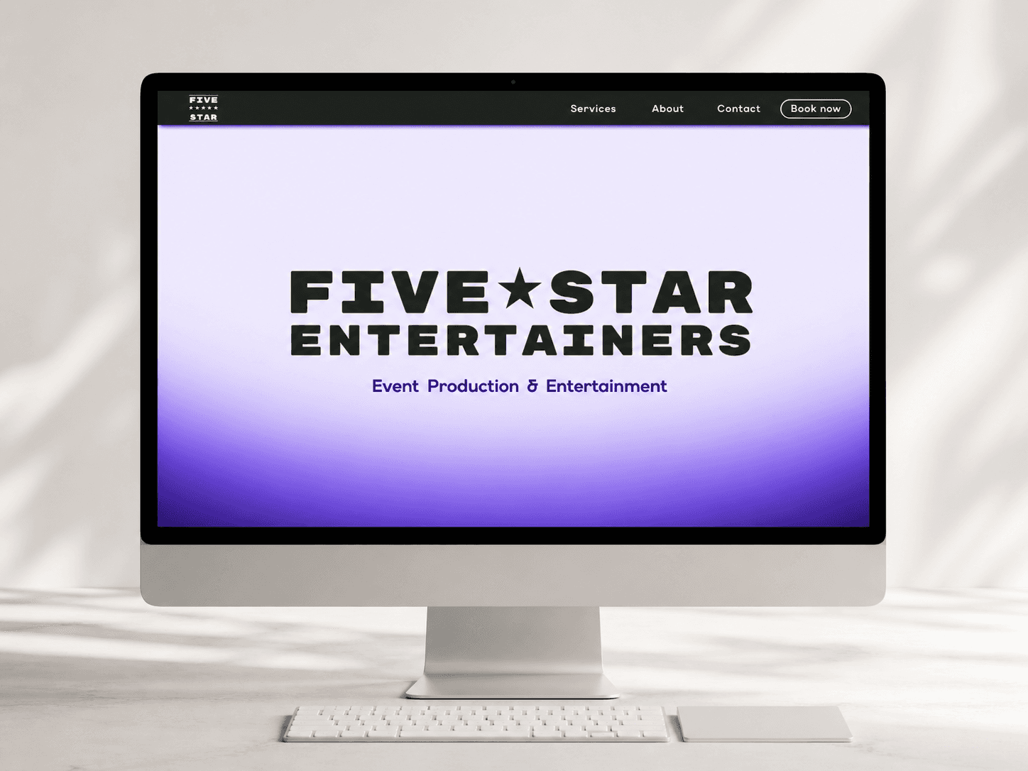
I raised the homepage Lighthouse accessibility score from 65 to 100 by improving global navigation, semantic structure, keyboard access, focus states, and link clarity.
Homepage accessibility score after remediation
65
100
Homepage Lighthouse
Before
30+ unlabeled image links
No skip link
Repeated navigation in the tab order
No landmark regions
Weak focus visibility
Services page had limited wayfinding
after
Text navigation with accessible link names
Skip link from the top of the page to main content
Semantic header, nav, main, and footer regions
High-contrast visible focus states
More efficient path to service and contact information
Scope note
Remediation focused on the homepage — the primary entry point and navigation layer. The structural fixes (semantic HTML, skip link, landmark regions, accessible nav) cascade to all pages once implemented, as the navigation is global across the entire site.